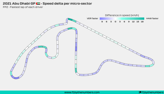
2021 Abu Dhabi GP: FP2 race simulation pace


- Like
- Digg
- Del
- Tumblr
- VKontakte
- Buffer
- Love This
- Odnoklassniki
- Meneame
- Blogger
- Amazon
- Yahoo Mail
- Gmail
- AOL
- Newsvine
- HackerNews
- Evernote
- MySpace
- Mail.ru
- Viadeo
- Line
- Comments
- Yummly
- SMS
- Viber
- Telegram
- Subscribe
- Skype
- Facebook Messenger
- Kakao
- LiveJournal
- Yammer
- Edgar
- Fintel
- Mix
- Instapaper
- Copy Link
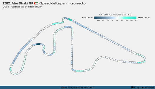
Click on the image to view the “image” in high resolution. Since it is a vector you can zoom in as much as you want. To get the hi-res png images click here, here and here.
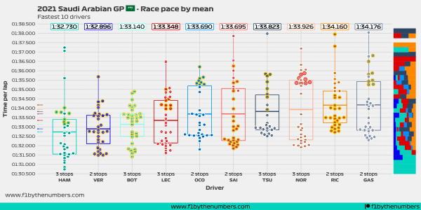
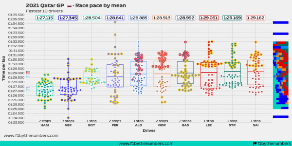
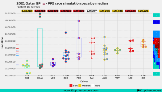
The numbers inside the dots represent the lap in which that particular time was done. Drivers who did their laps later in the session will tend to have faster times. Keep that in mind when comparing the lap times done by different drivers.
The box represents a traditional box plot, with the line in the middle representing the median time done by each driver. The top and bottom lines respectively represent the 75% percentile and the 25% percentile.
The arrows represent the median time done by each driver. With this addition, you can visually compare the median time among the drivers.
The histogram on the right side of the plot is binning the lap times in intervals of 0.25 seconds. This histogram is on a 100% scale, meaning that each bin is independent of the others.
If you do not see a driver in the plot, it is because he did not do a race simulation stint during the practice session.
You may see fewer laps than the number displayed above the driver’s name. This is because some laps were slower than the maximum time represented in this chart.
FP2 general overview


0 Comments