2021 Mexico City GP: Race pace


- Like
- Digg
- Del
- Tumblr
- VKontakte
- Buffer
- Love This
- Odnoklassniki
- Meneame
- Blogger
- Amazon
- Yahoo Mail
- Gmail
- AOL
- Newsvine
- HackerNews
- Evernote
- MySpace
- Mail.ru
- Viadeo
- Line
- Comments
- Yummly
- SMS
- Viber
- Telegram
- Subscribe
- Skype
- Facebook Messenger
- Kakao
- LiveJournal
- Yammer
- Edgar
- Fintel
- Mix
- Instapaper
- Copy Link
The images shown above are vectors. You can zoom in on them as much as you want to see in which lap was each individual time done. To get the high resolution png images just click here, here and here.
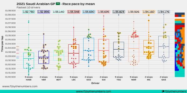
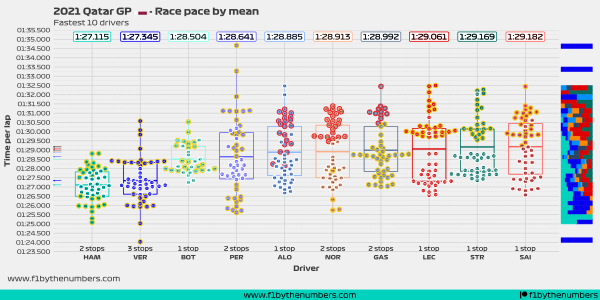
The main idea of this chart is to show the representative average race pace of each driver. Since plotting the raw data will not show accurate information, I have to do a bit of data pre-processing.
To remove the outliers, I use an IQR method. This means that the race pace analysis removes laps that are considered to be anomalous. This includes the first lap, laps done when the safety car was out and incomplete laps (laps when the driver went in or out of the pits).
If laps were done with the intermediate or wet tires, then they were considered for this analysis.
The box represents a modified box plot, with the line in the middle representing the mean (average) time done by each driver. The top and bottom lines respectively represent the 75% percentile and the 25% percentile.
The jitter in the x-axis doesn’t have a particular meaning. Its main purpose is to separate the points so that you to see the individual laps.
Remember that drivers with more pit stops tend to have faster times than drivers with fewer pit stops.
Race overview plot

This is a simple chart that shows all the representative laps of the race. As with the race pace chart, laps done under safety car condition were removed. If a driver went into or out of the pit lane, then that lap was removed as well.
If you want a hi-res image of this chart just click here.
Race summary table


- Like
- Digg
- Del
- Tumblr
- VKontakte
- Buffer
- Love This
- Odnoklassniki
- Meneame
- Blogger
- Amazon
- Yahoo Mail
- Gmail
- AOL
- Newsvine
- HackerNews
- Evernote
- MySpace
- Mail.ru
- Viadeo
- Line
- Comments
- Yummly
- SMS
- Viber
- Telegram
- Subscribe
- Skype
- Facebook Messenger
- Kakao
- LiveJournal
- Yammer
- Edgar
- Fintel
- Mix
- Instapaper
- Copy Link
0 Comments